The Political Geography of Boulder in 2021
NOTE: I am publishing this in August 2023 although it was in a final draft state in December 2021. Out of a obvious need for editing as well as the shock from the Marshall Fires, I delayed publishing editing for so long that it no longer felt relevant to share. Now that the 2023 local campaign cycle is beginning, it feels relevant again to share. Again, this is the version from December 2021.
Geography is one of the defining features of contemporary American politics. The polarization of our politics is deeply tied to spatial relationships: urban versus rural, coastal versus heartland, north versus south. People increasingly prefer to have neighbors who share their own values, a dynamic called “The Big Sort” by Bill Bishop in his 2004 book and similar dynamics have been identified by Andrew Gelman and others. We typically focus on political geography at the level of the state because of their role in national election outcomes (e.g., President and Senate), but there are fascinating and important processes of political geography that unfold at the local level.
Communities are not monoliths: “red” states have liberal enclaves and even the “bluest” communities have conservative voters. In the 2020 election, for example, Donald Trump and Mike Pence received approximately 20% of the votes in Boulder County and approximately 10% of the votes in the City of Boulder. I am curious about the local political geography of Boulder, not only because I am a Boulder resident, but also because (1) Colorado’s state government is dominated by Boulder politicians and (2) space is perhaps the defining issue of Boulder’s local politics. Because Boulder has many local issues that are much more competitive and/or divisive exploring the political geography at the level of neighborhoods can reveal much about the differences and the similarities in the values of the people who live here. These results reinforce findings from other political scientists that homeownership has a strong influence on political behavior.
This is admittedly a long post with lots of detail. Using data on elections, voter files, the 2020 census, and property records and aggregated to the level of voting precinct blocks, I analyze how this data varies across the map of Boulder, how variables vary with each other, and estimate models to explore how multiple variables explain political outcomes. This blog post probably falls in the unfortunate no-mans-land of being too long and technical for a general audience and too descriptive and atheoretical for a scientific audience. But I hope that some of the findings and the data, code, and other resources I developed for it can be of use to the general community.
Data
I used Jupyter Notebooks and the ecosystem of scientific libraries in Python to analyze and visualize election, census, and property data.
Election data
This blog post will analyze precinct-level data about the eight most recent elections in the City of Boulder. The Boulder County Clerk’s office publishes public election data at the precinct level in Excel format going back to 2012. I subset this county-level data down to the 88 precincts that recorded votes for Boulder City Council in 2013, 2015, 2017, 2019, and 2021 to identify the precincts in the City of Boulder.

Census data
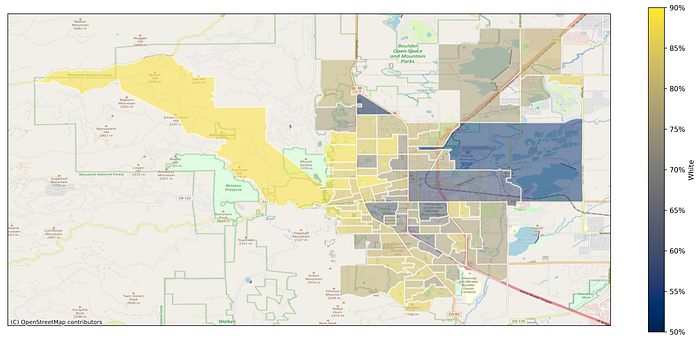
I am also going to use 2020 Census data aggregated to the precinct-level to capture race and housing vacancy. This is an example of a “choropleth”, a fancy information visualization term for a figure where spatial areas are colored to capture some value. In the case of the figure below, I have visualized the fraction of the population in each precinct that is white according to the 2020 Census. The precincts are defined by the areas with white boundaries and there’s a contextual plot of roads and other geographic features to help orient the reader. Yellower areas correspond to precincts with a higher percentage of white residents and bluer areas correspond to precincts with a lower percentage of white residents. The Sunshine Canyon and west Broadway precincts have particularly high white populations while the precincts for the University of Colorado, Boulder Meadows-Holiday, and Boulder Junction have the lowest percentage of white residents in Boulder.
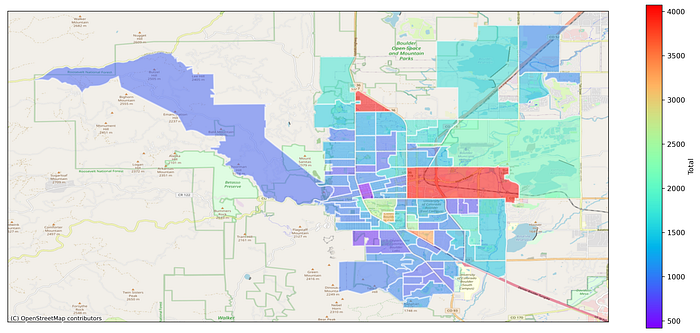
Here is another example of a choropleth visualizing the number of residents in each precinct using the Census 2020 data. I have used a rainbow-hued colormap to exaggerate the otherwise small differences in population: red-orange precincts have a larger population and purple-blue precincts have smaller populations.
Voter data
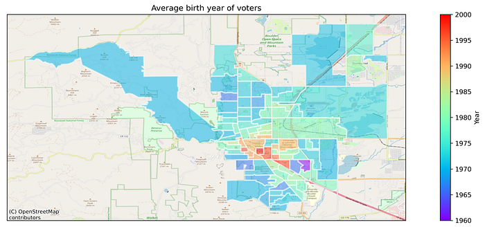
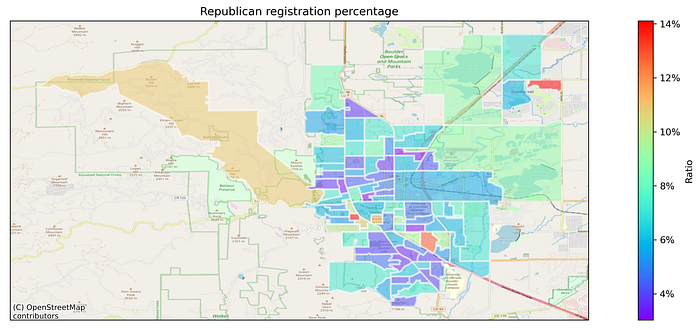
Boulder County Elections also publishes data on Registered Voters, a Voting Report, and a Master Voter History that record the name, address, party registration, gender, birth year, and history of voting in elections. Although these are public data, I have aggregated them up to the precinct level and report only averages. There is unsurprising spatial variation in the birth year of registered Boulder voters. The precincts closer to the CU Boulder campus (redder) have voters who have more recent average birth years than the bluer precincts.
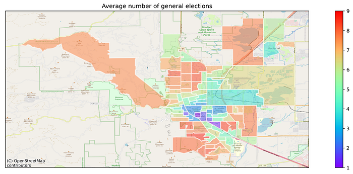
The data also records which elections voters sent ballots for, but obviously not their choices. Let’s count the average number of general elections (even year elections, not primaries or off-year elections) voters in each precinct have participated in. Unsurprisingly, that areas that had younger voters in the previous map are also the areas that voted in fewer elections.
Gender should be close to, but not precisely 50/50. Let’s compare the percentage of female registered voters in each precinct. The residential precincts are close to (or above) parity, but the precincts

Property records
Finally, I am also going to use detailed property records data from the Boulder County Assessor’s Office that includes details about zoning, building details, ownership, sales, and values. Using these primary data about property, I have derived some secondary variables to capture the variation across precincts around land use, age, size, residence, turnover, and cost. I’ll present these property data as choropleths now, but we will revisit them in subsequent sections as scatterplots to explain electoral behavior.
The property data does not contain voting precinct identifiers. To assign “strap” identifiers and parcel numbers in the property data to voting precincts I combine two geographic shapefiles. The first is the precinct shapefile from the Boulder County Clerk’s Office and the second is the parcel shapefile from the Boulder County Assessor’s Office. Then I use a remarkable geoinformatic algorithm called a spatial join to identify which parcel belongs to which precinct. Basically, as long as some part of the parcel boundary is inside the boundaries of a precinct, we can map the parcel to the precinct. We can then use this mapping to group all the properties in a precinct together and compute statistics about them.
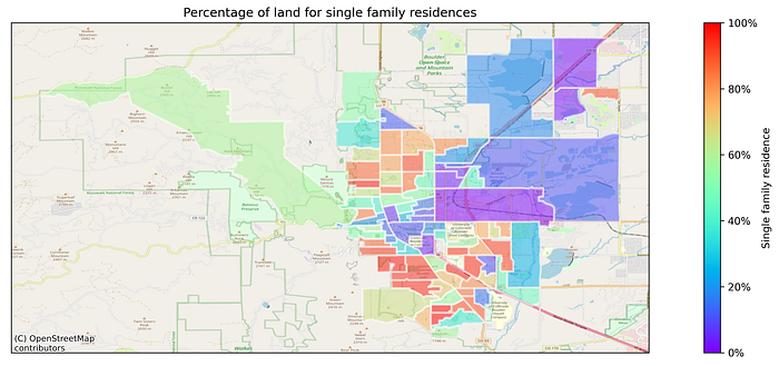
The first property choropleth uses data from the “Land” file to measure the fraction of land in the voting precinct used for single family residences. Every bit of physical land in Boulder County (houses, stores, parks, etc.) should be accounted for with a corresponding parcel. Land is classified for many types including residential, commercial, industrial, agricultural, and tax-exempt (government, church) purposes. Top-level classifications like residential land have sub-classifications for single family residences, condos, duplexes, triplexes, multi-unit, and so on. With that (shaky!) assumption in mind, I add up all the land corresponding to single family residences (“SINGLE FAM.RES.-LAND”) and divide it by the total land in the precinct. The result should be the fraction of land devoted to single-family residences: redder areas in the choropleth below are neighborhoods like Chautauqua and Martin Acres that are exclusively single-family residences and bluer areas are neighborhoods like Pearl Street Mall, CU Boulder, or Boulder Junction with more mixed residential or other non-residential uses.
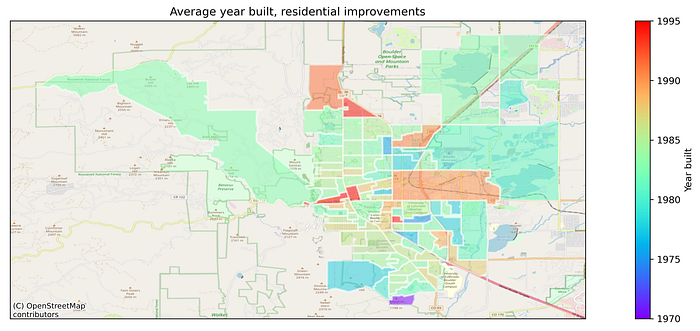
The second property choropleth uses data from the “Buildings” file that includes date of the “Effective Year” of construction or most recent major renovation. I focus on a residential buildings (single-family residences, condos, multi-unit apartments) and exclude commercial, agricultural, industrial, and government buildings since their construction and renovation are not major sources of debate or tension. The choropleth below visualizes the average “Effective Year” of construction for the residential properties in each voting precinct. Redder precincts have residential buildings that were (on average) built or renovated more recently and bluer precincts have residential buildings that were built or renovated longer ago. While there are pockets of newer developments (Dakota Ridge and Holiday in north Boulder, Boulder Junction in east Boulder), there is a remarkable uniformity in the average age of buildings
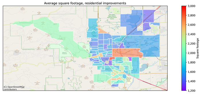
The third property choropleth also uses data from the “Buildings” file that includes the total finished square footage in the building. The choropleth below visualizes the average square footage of residential buildings in each voting precinct.
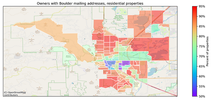
The fourth property choropleth uses data from the “Owners” files that includes the property and mailing addresses (for tax purposes) of owners. Comparing the property and mailing addresses, I look for properties whose owners’ mailing addresses are not in Boulder. This should roughly capture whether a property is the owner’s primary residence. Again, I focus on residential properties and exclude industrial, commercial, agricultural, and government properties.
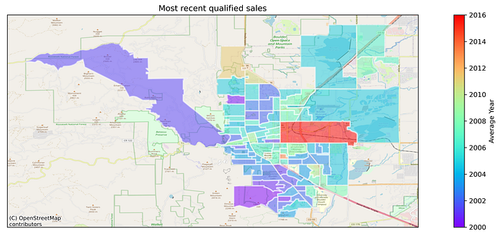
The fifth property choropleth uses data from the “Sales” files filtered for qualified (non-family) transactions involving residential property. The most recent transaction for each property was identified and then aggregated to the precinct-level to get the average year of the most recent transaction.
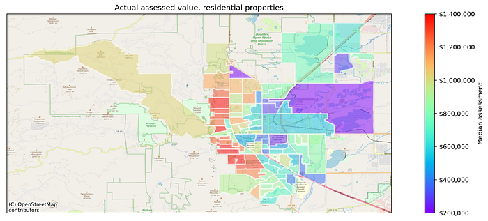
The sixth and final property choropleth uses data from the “Values” file and filtered to residential properties. The total actual value of the land and improvements (buildings) in each voting precinct is “medianed” (averaging skewed data like property values isn’t a good indicator of the central tendency).
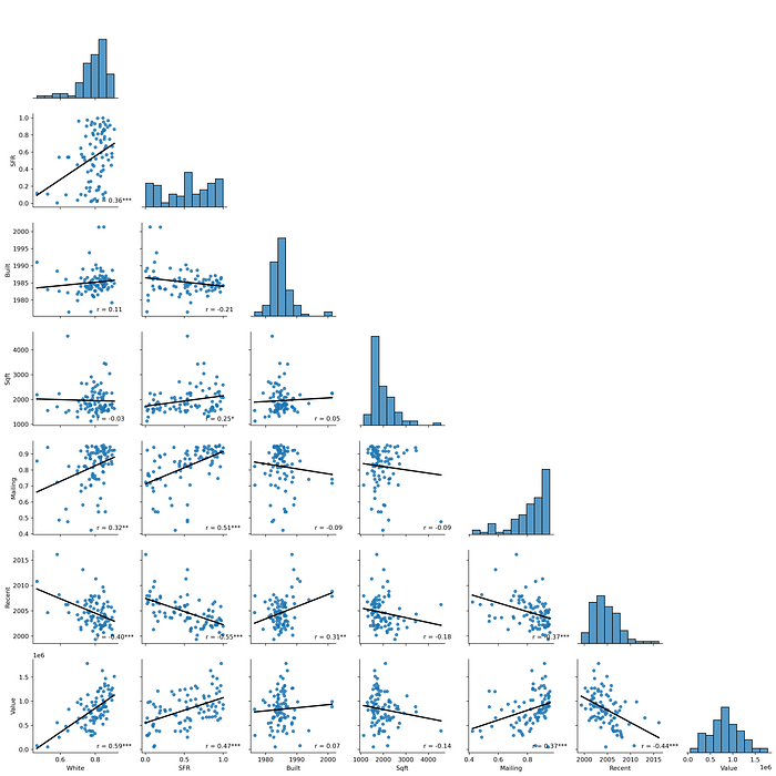
Because it’s hard to translate these spatial visualizations into traditional relationships, here’s a pair plot of the distributions and relationships among these demographic and property values. There are seven variables here, the diagonal is a histogram of the distribution of their values. Each of the scatterplots is a permutation of the relationships among these seven variables. The upper-left scatterplot is the relationship between single-family residences and white residents. The black line is a simple linear model fit to this data to illustrate the relationship, but you can see several examples of how sensitive it is to overfitting outliers.
2020 results
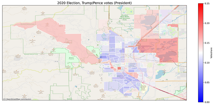
Let’s begin our dive into the political geography of Boulder by orienting ourselves to the results of the 2020 election. Turnout in presidential election years is significantly higher than in either mid-term or off-cycle (“odd year”) elections. Some voters skip or ignore some races, so the turnout is not the same for every race. The choropleth below visualizes the precinct-level turnout (ballots cast divided by active voters) for the 2020 presidential race. Boulder, like the rest of Colorado, has an impressively high turnout due to the convenience of mailed ballots. But there is still substantial variation across precincts for turnout numbers. The precincts containing and adjacent to the University of Colorado have much lower turnout than the residential neighborhoods to the north and south. Note that this is not an effect of international students or unregistered voters: the denominator in this calculation is active voters not residents. It could be an artifact of former students’ registrations still tied to their addresses, but CU students still vote at much lower rates than the rest of Boulder.

While Trump/Pence won only 10% of the votes cast by citizens in the City of Boulder, this obscures significant spatial variation in his support. Trump/Pence received up over 20% of the total votes cast in several precincts (brighter red shades): the CU campus and Hill neighborhood in central Boulder, the Sunshine Canyon community in the mountains to the west, and the northwestern reservoir communities. This (weak) support for Trump was counter-balanced by neighborhoods in south Boulder, Mapleton Hill, and north Boulder where he received less than 10% of votes (darker blue shades) in these precincts.
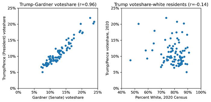
While split-ticket voting has become rarer: voters are more inclined to support parties than candidates. Votes for Trump should correlate strongly with votes for other national Republican candidates. The precinct-level voteshare for Trump was strongly correlated (r=0.96) with the voteshare for other Republican candidates like Senator Cory Gardner (left plot, below). This is perhaps the clearest example we will see of precincts behaving similarly to other precincts.
Despite Boulder’s superficially favorable demographics (a majority-white suburb), the precinct-level voteshare for Trump was weakly negatively correlated (r=-0.14) with the percent of the precinct that is white (right subplot). Trump’s support in Boulder cannot be attributed to simple racial demographics since some of the whitest precincts had the lowest support for him while some of the least white precincts had the greatest Trump support.
We can use a ordinary regression model to explore the effects of multiple variables. Below is an ordinary linear regression model estimating precinct-level support for Trump using precinct-level variables derived from the Census and Assessor’s office. This model could potentially be misleading since I am using data for things have changed between November 2020 and December 2021, but I would argue these changes are negligible.
- Gardner: voteshare received by Cory Gardner (Clerk)
- White: fraction of the population that identifies as white (Census 2020)
- SFR: fraction of all properties that are single family residences (Assessor)
- Built: average year residences were built/remodeled (Assessor)
- Sqft: average square footage of residences (Assessor)
- Mailing: fraction of owners with Boulder mailing addresses (Assessor)
- Recent: average recent qualified sale year (Assessor)
- Value: median actual assessed property value (Assessor)
The model performance is extremely high (R² = 0.94) but this is because we included the highly-correlated Gardner voteshare as a control. Precincts with lower turnout, more recent sales activity (marginal significance, p = 0.074), and higher-value houses all have significantly less Trump support. Interestingly, there is some residual variance after controlling for Gardner voteshare (and all the other variables) that is significantly and positively correlated with Boulder owners (“Mailing”). Put another way: precincts with a greater percentage of Boulder-based property owners were significantly more likely to vote for Trump — in excess of what we expect from Gardner supporters — than precincts with more property owners outside of Boulder.

2021 results
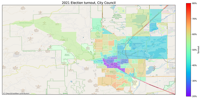
The 2021 election in Boulder was dominated by three local ballot issues (Questions 300, 301, and 302) as well as the election of five city council members. First, let’s visualize the turnout (ballots cast divided by active voters) for the 2021 city council elections. Turnout in this off-cycle election is unmistakably lower: there were only 4 precincts with less than 75% turnout in 2020 (average 89.4%) but 100% of precincts had less than 75% turnout in 2021 (average 47.7%). There is significant variation in turnout by precinct: those including and adjacent to the CU campus have extremely low turnout (less than 25%) while some of the residential precincts in central and south Boulder have turnout exceeding 60%. It is important to keep this spatial variation in turnout in mind as we explore precinct-level differences in various races.
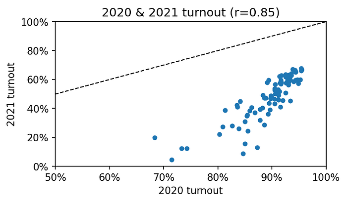
We can compare the changes in turnout behavior more clearly with a scatterplot of the 2020 against the 2021 turnout. There’s a very strong correlation here: high-turnout precincts in a national election year tend to remain (relatively) high-turnout precincts in an off-cycle election year while low-turnout precincts remain low-turnout. However, the staggering drop in turnout for the off-cycle elections is obscured by these axes: the x-axis for the 2020 turnout runs from a minimum of 50% all the way to 100% while the y-axis for the 2021 turnout runs from a minimum of 0% to 100%. The dashed black line in the upper-left captures the democratic ideal if turnout remained the same between elections — but no precinct gets close!
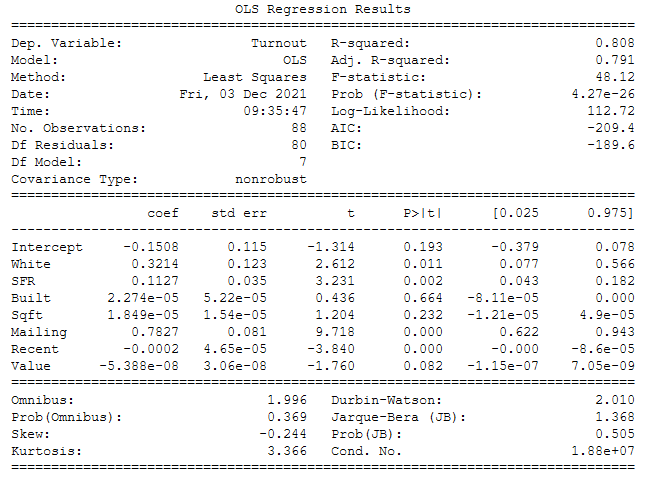
What variables explain the differences in turnout across voting precincts? The model performance is remarkably high (R² = 0.808) for behavioral data and several variables are statistically significant (p < 0.05). The white population of a precinct is significantly and positively correlated with voter turnout. Next, the fraction of single-family residences is also significantly and positively correlated with turnout. The average built/remodel year and size of houses are not significantly correlated with turnout. The variable with the strongest effect is the fraction of owners with Boulder mailing addresses: precincts with more owners living in Boulder are very strongly correlated with greater turnout. The most recent average transaction year was significantly and negatively correlated with turnout: precincts with newer owners had lower turnout. Finally, the median assessed value of properties in the precinct has a negative and borderline significant (p=0.08) correlation on turnout. Taken together, the model estimates that Boulder precincts that long-time white residents living in single-family residences are the most likely to turn out in high numbers.
Question 300
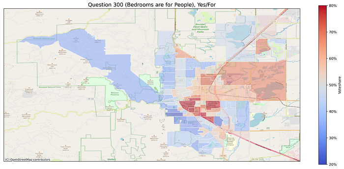
Question 300 sought to revise Boulder’s residential occupancy limits and failed 48% yes to 52% no. Using the total votes cast as a measure of enthusiasm, this was the most important issue to Boulder voters. Examining the voteshare by precinct, there is an unmistakable spatial division in the support around the issue. The strongest support was centered on precincts around the University of Colorado and Boulder Junction with younger and newer residents in denser residential settings. However, the strength of this support was offset by the low turnout (see above) in these precincts. The strongest opposition came from the precincts west of Broadway with established residents in single family homes.
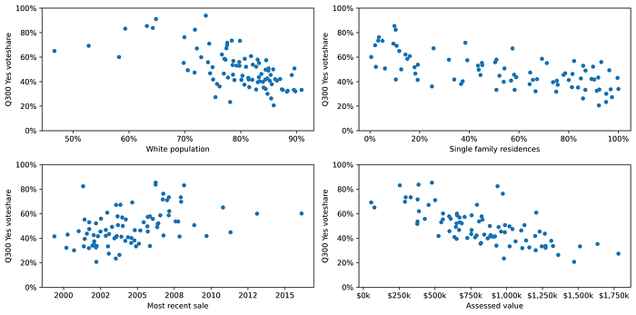
There are some strong correlations between demographics and property variables and support for Question 300. Precincts with a greater percentage of white residents, more single-family residences, older transactions, and greater value are all correlated with less support for Question 300.
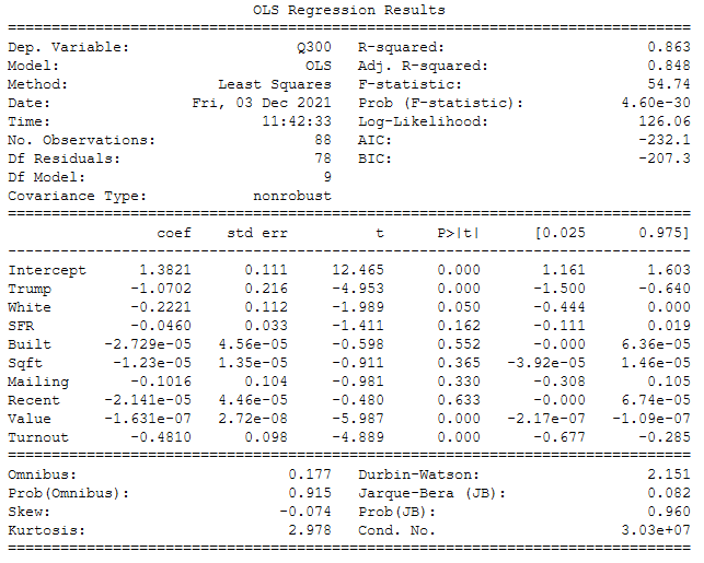
These variables are all correlated with each other, so we can use multiple regression to parcel out the effects of each on the support for Question 300. The model performance is very good (R² = 0.863) and it estimates precincts that had stronger support for Trump in 2020, greater turnout in 2021, and a larger fraction of a white population were significantly less likely to support Q300. None of the property variables involving single-family residences, average building age, average building age, Boulder residents, or recent sales were significantly correlated with Q300 support. However, property variables for median residential value was significantly and negatively correlated with Q300 support. This model implies that opposition to Q300 was strongly influenced by precincts with more conservatives, White residents, high-value homes, and high-turnout behavior.
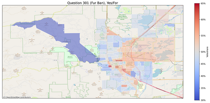
Question 301
Question 301 sought to prohibit the sale of fur products and won 51% yes to 49% no. This close result surprised myself and many commentators given the relatively low stakes and lack of attention to the issue. There is a similar, but not identical, support patterns between Questions 301 and 300 centered on the CU campus and Boulder Junction supporting and the neighborhoods west of Broadway opposing. But the strength of this support or opposition in any given precinct is also comparatively weaker: the strongest precincts only mustered 65% support and the weakest precincts only showed 35% support. A precinct-level regression model identical to Q300 was estimated and its performance was good (R² = 0.555). The only significant variables were 2020 Trump voteshare (negative correlation) and 2021 turnout (negative correlation).
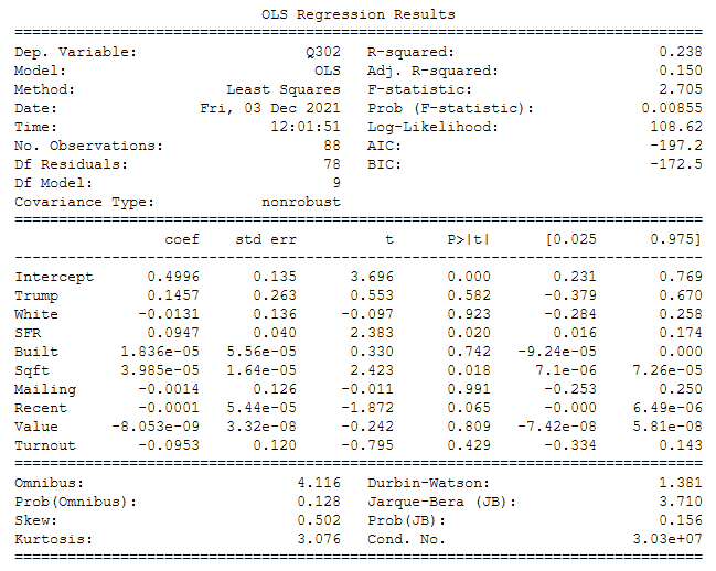
Question 302
Question 302 sought to revise the City’s annexation agreement involving the “CU South” parcel and failed 43% yes to 57% no. Confusingly, a “yes” is effectively a vote to oppose the agreement while a “no” is a vote to support the agreement. The parcel-level results reveal an unmistakable spatial dynamic in voting on the issue: the strongest support for the measure came from the precincts near the CU South parcel while university and more distant precincts were more strongly opposed. This pattern of localized “yes” and distributed “no” is a classic fingerprint of NIMBYism: the closest communities oppose the development while the rest of the city supports it so it doesn’t end up in their back yards.
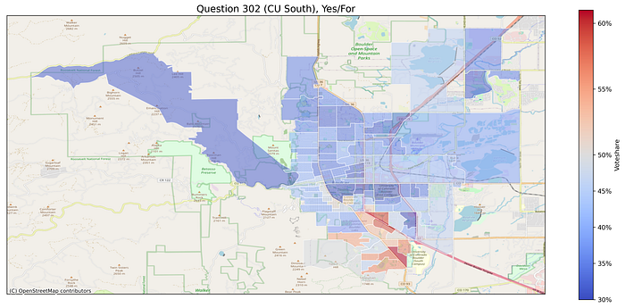
Given the importance of proximity to CU South as an explanation for support on this issue, an ordinary regression assuming that all precincts behave independently is not an appropriate modeling choice, but we will stick with it in the name of consistency. The model performance is adequate (R² = 0.238) but much poorer than the other models, reflecting the presence of the obvious but unestimated variable involving proximity. Precincts with larger residences and older sales (marginal, p = 0.065) were significantly more likely to support the issue.
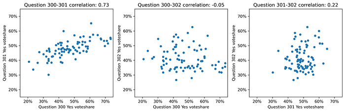
Comparing Questions 300, 301, 302
The choropleths above are poor visualization choices for capturing the relationship between multiple outcomes. The figure below captures the precinct-level voteshare correlations for the three pairwise permutations of questions 300, 301, and 302. I want to continue to build up our intuitions about similarities across races as a down payment for later analyses.
There is a very strong correlation (0.73) in the voteshares for Questions 300 and 301: precincts that voted in support of Question 300 were also likely to vote in support of Question 301: occupancy reform supporters also supported the fur ban and vice versa. There is a weak (-0.05) correlation in the voteshares for Questions 300 and 302, which is a surprising result since these were the two most polarizing issues. This suggests lots of “split-ticket” voting between the occupancy reform and CU South annexation, likely related to CU South proximity. There is a moderate correlation (0.22) in the voteshares for Questions 301 and 302: precincts supporting the fur ban were also likely to support restrictions on the annexation of CU South.
City Council
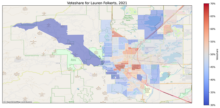
There were ten candidates for five city council seats. Boulder’s city councilors are elected by the entire city rather than specific districts, so the five candidates with the most votes won the seats. Rather than visualizing all ten candidates’ precinct-level support (see the notebook for all the results!), I will focus on two cases.
Lauren Folkerts ran on a slate of progressive endorsements. Her supporters are “east of Broadway” and centered on the CU Boulder campus and eastern mixed use precincts. Her weakest support was in the residential neighborhoods “west of Broadway”.
Tara Winer ran on a slate of moderate endorsements. Her supporters are “west of Broadway”, particularly around Chautauqua and Sunshine Canyon. Her support was weakest in the “east of Broadway” precincts including CU Boulder and mixed use districts.
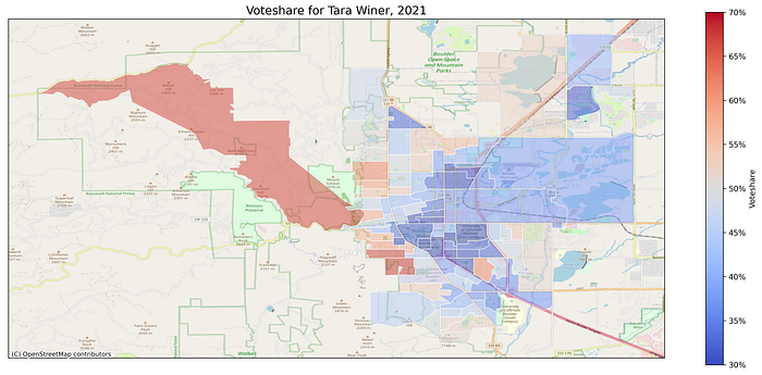
The polarized support for different candidate slates has an undeniable spatial component setting northern and western residential precincts against central and eastern university and mixed use precincts. The polarization can also be found in this visualization by different groups.
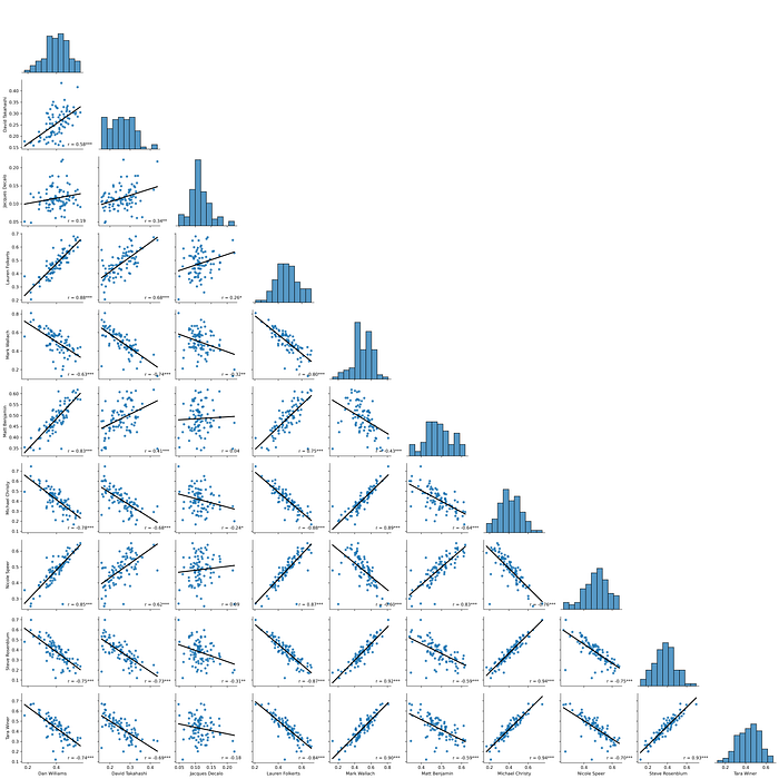
This can be seen more explicitly in the pairplot visualization of each candidate’s voteshare against the other candidates. The precinct-level correlations for many candidates show extremely strong positive and negative correlations capturing this slate-voting dynamic. The correlation in voting between Nicole Speer and Steve Rosenblum was -0.87: the precincts supporting Rosenblum were not supporting Speer. The correlation in voting between Nicole Speer and Lauren Folkerts was 0.87: their support was close to identical across precincts. Takahashi and Decalo, who were not clearly aligned with either slate, had much weaker correlations.
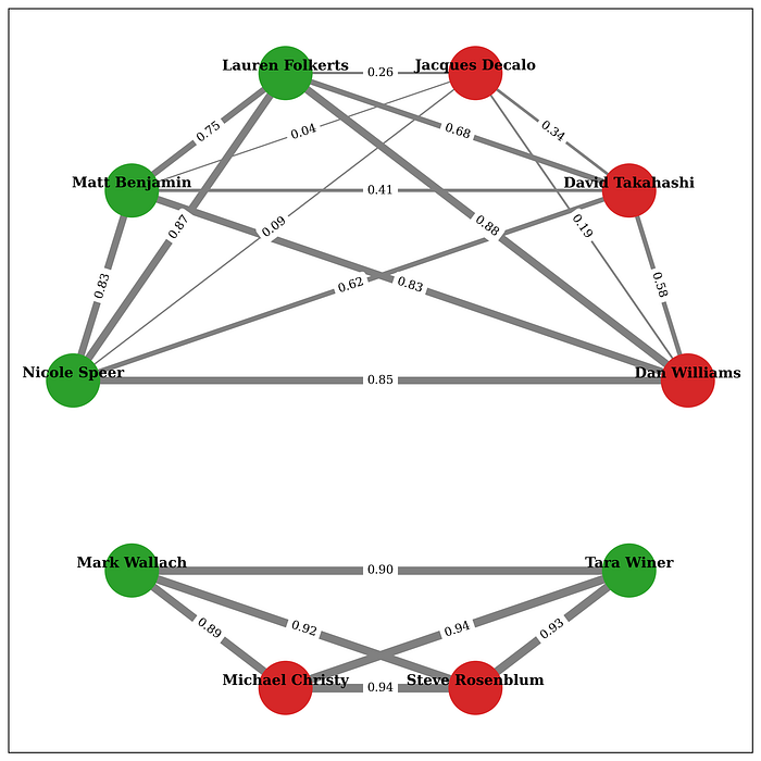
There is admittedly a lot to digest in the pairplot, so I also visualized these pairwise candidate correlations as a network. The circles are the ten candidates and are colored green if the candidate won and red if they did not. The grey lines connecting each circle is the correlation in those candidates precinct-level voteshares. I have only included positive correlations. This visualization demonstrates the polarized voting behaviors between the two slates of candidates: progressives on top (Benjamin, Folkerts, Speer, Williams) and moderates on bottom (Christy, Rosenblum, Wallach, Winer) with no connections between these groups. The moderate slate of candidates had much stronger correlations (0.89–0.94) compared to the progressives (0.75–0.88), suggesting much stronger slate voting. It also shows that support for Decalo and Takahashi aligned with and potentially diluted the strength of the progressive slate.
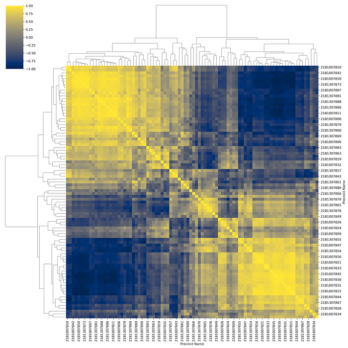
Here is a third way to visualize the polarized result of the 2021 city council election. This is a heatmap with Boulder’s 88 precincts as rows and columns. The color of a cell is a measure of the cosine similarity of the voting behavior between a precinct and another precinct. Yellower values closer to 1 indicate these precincts’ voting behavior was more similar and bluer values closer to -1 indicate these precincts’ voting behavior was more dissimilar. The values are symmetric around the upper-left to lower-right diagonal of precincts’ self-similarities. Each precinct’s row and column has been shuffled so that it is close to similar others. You can see a blob of yellow in the upper left and another blob of yellow in the lower right: these two blobs capture the polarization of the Folkerts versus Winer in the examples above, but using the data from all 10 council races. If you squint, you can discern smaller clusters or bridging clusters.
Elections 2012–2021
We have focused on the 2020 and 2021 elections, but we can also incorporate the precinct-level data available from the Boulder County Elections Office back to 2012. Rather than trying to dive into specific races and candidates, I want to combine the precinct-level information for every contest (national, state, local, and ballot issues) to understand the similarity of precincts’ voting behavior across time.
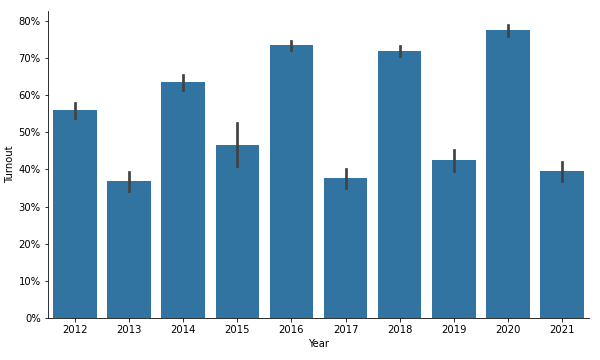
First, we can measure how turnout has changed over the past decade. Two patterns jump out in the chart of average precinct-level turnout below. One, turnout in even year elections is increasing to respectable levels of 70% or more. Two, there’s an unmistakable pattern of odd year elections having significantly lower turnout and is not increasing. This enthusiasm gap between odd and even-year elections is a cause for concern about whose preferences for politicians and policies are being captured.
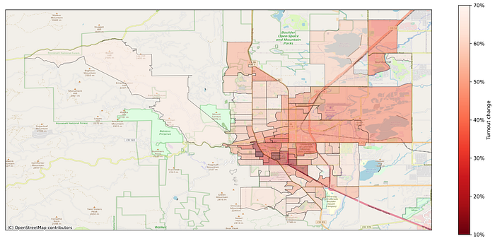
Second, we can examine how this turnout changed from 2020 to 2021. As we have already seen over and over again, this off-cycle enthusiasm gap is not evenly spread across precincts and has a very strong spatial component. Even the most civically-minded precinct had only 70% of the turnout in 2021 as it did in 2020. These high-turnout precincts are generally in the heavily residential areas west of Broadway and in North Boulder. But the precincts with the turnout change are, perhaps unsurprisingly, clustered around the CU Boulder campus and the higher-density precincts close to 28th Street. The turnout change in these precincts was as low as 10% of turnout in 2021 compared to 2020.
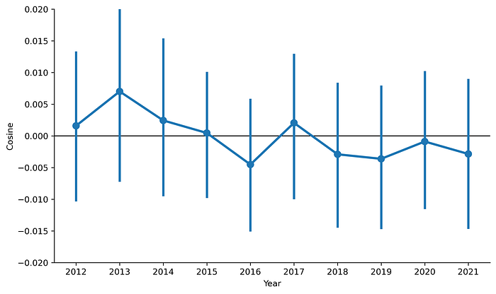
Third, we can measure the changes in precincts’ voting similarity over time. For each year, I represent each precinct’s voting behavior as a vector of their voteshares on the elections that year. I can compute the “cosine similarity” between two precincts’ voting behaviors: values closer to 1 mean the precincts voteshares are identical across races, values closer to 0 mean they are unrelated, and values closer to -1 mean they are opposites. (We could use a correlation coefficient instead and get qualitatively similar results.) I compare all 3,828 precinct combinations to get their similarity scores. And then I repeat for all 10 elections.
The chart below is a pointplot capturing the average value (circle) and the 95% confidence interval of the estimate (lines). Basically, the average of precincts’ voting similarity has shifted from (barely) positive to (barely) negative in the past 10 years. The fact the lines around the points are so large and overlap with the next year’s point implies we can’t rule out these differences being statistical noise, but there’s a rough trend towards precincts’ voting behavior becoming anti-correlated. If there’s a signal to be found here, I think it’s evidence of increasing polarization in our local elections: more precincts are voting not just differently but the opposite of how most other precincts vote.
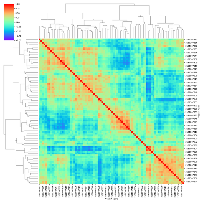
Fourth, we can measure the similarity of precincts’ voting similarity across all 10 years of election data. Using the same voteshare data as above and adding in the turnout data, we can visualize the 3,828 comparisons of precincts’ voting behavior. The visualization below is analogous to the heatmap we did for the 2021 council elections: 88 precincts as rows and columns, the colored are the cosine similarity of the voting behavior between a precinct and another precinct, and the heatmap is symmetrical around the diagonal (red cells). Redder areas indicate greater similarity between precincts, greener is more unrelated, and purpler is greater anti-similarity. The rows and columns have been shuffled so that similar precincts are grouped together. Depending on how you squint, there’s something like 3 or 4 clusters of red areas around the diagonal.
Another way we can try to visualize the similarity of precincts is to use a technique from machine learning called “dimensionality reduction”. We do fancy math to convert the 508 columns corresponding to various races from 10 years of elections for each precinct down to just two columns of numbers that preserve as much of the relationships and variance. If that doesn’t make sense, think of a three-dimensional object casting a shadow: the shadow is a kind of 2D representation of the 3D object. These are the shadows of all 88 of our precincts from a 508–dimensional space. I like to use UMAP for this, but social scientists may be more familiar with methods like principal component analysis (PCA) and computational lingusts may know t-distributed stochastic neighbor embedding (t-SNE).
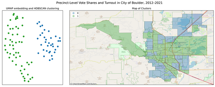
The figure below has several subplots. The largest plot on the left contains a scatterplot of the two-dimensional UMAP embedding from our 88 precincts’ voteshares and turnout from 508 races and elections from 2012 through 2021. There are two to three clusters of precincts present in this representation. I use four different clustering algorithms to see what clusters they can discern from this data. They pick up similar, but not identical, clusters.
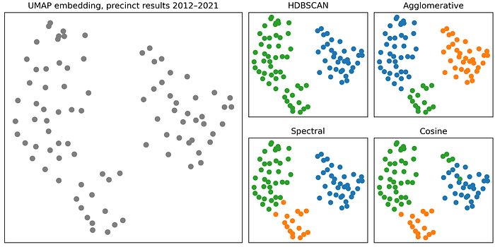
I realize the last three plots were maybe too much data science abstraction and you want some maps. So back to the maps. The four approaches to clustering our dimensionality-reduced precinct-level voting behavior are visualized below. The HDBSCAN algorithm only found two clusters of precincts (green and blue). The blue precincts are wealthy and residential and the green is everything else. The other algorithms find three clusters, the same wealth and residential cluster and the other split into precincts mostly around CU Boulder and then everything else, which tends to be commercial and mixed-use areas.
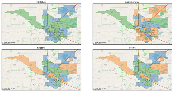
Here’s a more direct mapping of the “abstracting the relationships between 88 precincts from 508 elections into two dimensions” on the left into where these clustered precincts are on a map on the right.
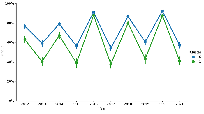
Measuring turnout by cluster over time, we can see a robust pattern that the blue clusters have significantly greater turnout.
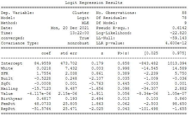
With our two clusters defined only by similarity in voting behavior over the past decade, what demographics and property values are significantly correlated? With the binary outcome 0 or 1, we use logistic regression to model the marginal effect of each variable on the odds of a precinct transitioning from a 0 (rich residential cluster) to a 1 (everyone else). The clusters we’re trying to predict were determined purely by the voting behavior of 508 races and turnout over 10 years. These explanatory variables tell us the impact of a precinct’s averaged property and demographic features on whether or not it’s in cluster 0 or 1.
The model estimates are in the table below. Property variables like square footage, single family residences, or a Boulder mailing address and demographic variables like White residents are not significant predictors of membership in cluster 0 or 1. Precincts with older buildings and higher property values (marginal) are significantly more likely to be in cluster 0 than 1. Precincts with voters who were born later, have more women (marginal), and fewer Republican voters are significantly more likely to be in cluster 1 than 0. I am surprised that property-related variables do not have greater significance in this model, but this model’s explanation of the forces contributing to Boulder’s polarized voting behavior is consistent with our earlier findings and intuitions.
Conclusions
If you made it this far, there’s unfortunately no $50 bill waiting for you in a locker.
The precincts with older, more male, and more conservative voters living with older and more valuable property who consistently vote in very similar ways across elections and turnout …and there’s everyone else. This distinctive cluster of precincts have significantly higher turnout in elections even though they make up a much smaller portion of the electorate.